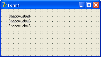
TShadowLabel is a label component derived from TLabel. It's just a simple label component that draws a shadow behind the text. You may select the shadow color freely. If you disable the shadow the behaviour of the TShadowLabel component is the same as the TLabel component. This component is nothing special. It is one of my first steps in writing my own components. So if you have a look at the source code you may easily find something out about creating yout own custom components or change the behaviour of components to exactly meet you needs. You can see the TShadowLabel component below (one with a dark shadow color, one with a lighter shadow color and one with shadow disabled):

firstly, a TShadowLabel with shadow color clGray
secondly, a TShadowLabel with shadow color clSilver
and finally, a TShadowLabel with shadow disabled.
In comparison to a normal TLabel component TShadowLabel has two additional properties:

To learn more about writing and customizing components have a look at this topic:
- writing a simple link label
more topics to come ...
You can download the source code of the component and also the component resource file below:


